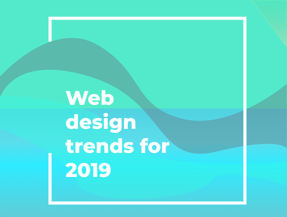
Top 8 Web Design Trends of 2019 That Were Exceptional
And here we are, ending an amazing year! In the year full of ‘ hashtags ’ and ‘trending now ’, I have summarized this article for the most loved trends in the websites that have been observed and proved beneficial for boosting business and making it more visually appealing for clients, our known entity.
It is a must to keep up with upcoming trends and also to have knowledge about, how this is different from the previous trends, knowing about its features helps us to make efficient use. UI UX Design companies can help you to achieve these trendy things so you don’t have to reinvent the wheel & also we’re one of the finest graphic design studios in Mumbai.
So, here are the 8 unique design trends for 2019!
1. Micro Interaction
2. Natural-looking photos
3. Super-functional logos
4. Broken grid and overlapping images
5. Fluid/organic/asymmetrical design and elements
6. Pushing the boundaries of typography (custom font)
7. Thumb-friendly navigation
8. Flat 2d animations
Lets Us Understand Each in Details
1. Micro Interaction
They are basically responses given after certain actions are done. This can also be used as a method for instant feedback, act as notifiers or just be given to miniature icons at the background to make it more attractive.
They encourage users to give feedback or do certain actions that would trigger the micro-interaction present in that particular icon and making the user more engaging!.
They can be used as the replacement of pop-ups after certain actions, as micro-interaction can be given to icons and can be made self-describing and convey the same information which a text would do, but in an interesting way.
Eg 1: Imagine a car advertisement having circular motion just for wheels or just blinking headlight! cool yeah? This feature can be given to any part of the car, which we would like so as to make it stand out.
Eg 2: After clicking on the add-to-cart icon, a trigger is set which shows to completion with a motion. Keeping in mind such small details improve the overall website rating and make it more appealing to the user.
2. Natural-looking photos
Nowadays natural photographs are preferred as they enhance the look and feel, adding more warmth to the site. They describe a situation well depending on the type of environment we want to showcase, the old stock photos have drawbacks of being reused and chances of appearing on multiple sites.
Hence it is suggested to use natural photographs with high resolution which will make the website look more real and rich.
3. Super-functional logos
One of the important objects of the site is the logo, the functional logo should be self-describing, and it should attract the clients by viewing it. The functional logos include the features and aim of the site along with some animation and importantly it must be unique. They should maintain the consistency of look and feel.
Eg: As for the above logo it describes techies providing services for your product sites.
4. Broken grid and overlapping images
Grids are used to organize contents by breaking up the page into proportional sections. Broken grid design helps more contents to be showcased along with underlying images. Basically, the thing that is done here is, creating an illusion of 3-dimensional display for users.
You can grab the user’s attention to a particular feature as you can display multiple functionalities by overlapping grid images over text in a single page.
Ease of access to the contents is provided here as user has highlights of various contents available on the site through the combined display of images and texts. This can be also termed as a callout or popup, as it is mainly used for grabbing user’s attention.
Avoid clustering of too many overlapping grids and see to it that there is enough balance of white-space kept, usually this underutilized. White space also adds on to the perfect website layout and helps the display look soothing to the eyes.
5. Fluid/organic & asymmetrical design and elements
Let us begin with asymmetrical design, even though symmetric designs helps to balance out an object, asymmetrical designs are on the trend because they look interesting, unlike traditional designs. They are not confined within a defined area.
Also early only symmetric layout pattern was observed, which included splitting the screen into equal parts but now most of the websites use an asymmetric layout like diagonal or slanted division.
fluid /organic shapes: These allow a variety of different shapes to be included in the website and provide freedom to the designer to put the imaginary shapes onto the screen, and is not restricted with limited shapes will designing the site. They can be characterized by the shapes derived from the surrounding environment.
Fluid shapes can be given colour gradation or can be given animation etc, most of the time designers prefer to give such shapes electric colour and depicting it as a surreal art. When implemented properly it turns out to be the most interesting for the users.
6.Pushing the boundaries of typography and applying custom font
Typography is difficult to feature to implement as compared to other feature in websites even though it is easy to print them. But it takes the website to a new level and grabs the most attention.
The texts are manipulated and yet readable. Use of dramatic text is observed to express the word and make it look creative and contribute to the overall design.
Typography trends in 2019 included the following types:
· Overlaying text
· Bold display
· Scattered text
· Animated display of words
· Vintage style display of words
With the help of the latest features provided by html5 and CSS3, it helps the web designer to push the limits and create amazing text designs that get along with the overall content of the website.
There is a wide range of fonts available, but creating custom fonts, is the new thing which makes the web page distinctive.
7. Thumb-friendly navigation
While designing website designers should keep in mind users have the freedom to choose can use any device to access the site.
Thumb-friendly navigation feature is for mobile screen users, it helps to access all facilities within the thumb zone, and hence keeping comfort as a top priority of the user.
It can be achieved by providing menus at the top as well as at the bottom rather having it only on a single side, leading to a long (drop-down) list which won’t be able to fit within the screen area. The rest of the area can be utilized by providing links etc which are less frequently used.
8. Flat 2D Animations
Animations are always considered as the feature which brings life to our website. They play an important role in keeping the users engaged on the sites, with fun surprises by giving simplistic movement to objects.
Animation can be bifurcated further, depending on where it is used, as in while loading the website, scrolling through the home page or swiping through the image gallery.
So in this article, I have tried to cover the 8 design trends that made websites standout and added an extra star to the site. Adding these features will definitely make your website look more energetic and dynamic.
As we have seen a lot of modifications and changes have been done as compared to the previous year, so we can conclude that designers are positive about the experimental results and hence a lot of new trends can be expected.